Here Is the Single Least Productive Thing You Still Make Your Employees Do

Numbers, numbers, everywhere — but one of the best lessons I’ve learned in my career is to stop reacting to every up and down in a metric. Stop trying to explain every data point that’s off the average.
Instead, it’s more helpful to start looking at the bigger picture: performance over time. When we react less, we can lead better, and we end up improving more.
The Virtue of Reacting Less
For example, now that the final 2019 numbers are tabulated for your department or organization, what’s next? You might be asking your employees to compare those numbers against 2018’s. Is the number of unfilled positions lower than before? Is the average time required to fill a position longer than the previous year?
You might ask your staff to compare December’s numbers to the month before, and then you might also compare those numbers to the previous December. You might find confusing comparisons. Perhaps your employee turnover rate for December was lower than November (good!) but it was higher than the previous year’s December (bad!).
Do these simple comparisons really help you understand your business better and position your organization for improvement?
Far too often, leaders ask people to explain or react to every small change in a performance measure. They might think they’re being action-oriented — that they are driving results — but this approach leads to a lot of wasted effort. Time is wasted when people are pressured to go chasing (or cooking up) an explanation that sounds reasonable for each change in every metric. All of this distracts from your ability to actually improve work performance in a meaningful and sustainable way.
If an HR analyst is asked to dig into the difference between the two most recent data points, they might initiate some phone calls and meetings that consume hours of the organization’s precious and limited time. That time could have been spent, instead, on activities that might actually improve the metrics you care so much about.
What the Academy Awards Can Tell Us About Work
You might have seen recent headlines lamenting that television ratings for The Academy Awards were down 20 percent compared to 2019. We see headlines like this about the difference between two data points all the time — but to what effect?
A 20 percent decline in viewers might sound like a large drop, so people inevitably speculate about the causes. There must be a cause we can point to, right? Maybe. Maybe not.
For more expert HR insights, check out the latest issue of Recruiter.com Magazine:
Again, we need to step back and look at more than two data points — we need to look for more context that might help us understand whether the changes in our metric are meaningful or insignificant. We need to look for real trends.
So what if we add a third data point? Looking at the 2019 viewership numbers, we see they were up 12 percent compared to 2018. The ratings were up in 2019, allegedly, because the Oscars went with a new hostless format.
However, making a change to the system doesn’t necessarily change results in a meaningful way, and it doesn’t necessarily mean any changes in the results were caused by that change to the system. Did more people tune in to see if the new approach would be better (or if it would be a disaster)? Were ratings now down this year because the novelty of the format had quickly subsided? If it is looking to improve viewership again, what changes should the Academy make in 2021?
When looking at changes in any metric, it’s possible that number is simply fluctuating around a stable average over time. There might be no root cause for the relatively small change in the numbers. Whether we’re talking about the Oscars or our workplaces, we can’t draw any meaningful conclusions from two or three data points.
The better approach is to use a spreadsheet or a business reporting tool to draw a line chart (a.k.a., a “run chart”) that shows 10 or 12 or 20 points. This will help you see, in a very visual way, whether performance is just fluctuating (which statisticians call “noise”) or there is a meaningful trend (or “signal” of significant change to the numbers).
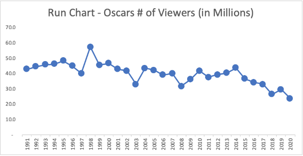
A line chart for the number of viewers for the Oscars, going back to 1991, might look like the last 30 data points in one of your monthly metrics at work:

Looking at additional data points in a visual format helps us see that the up and down of the last three years isn’t the important part of the story. Those three numbers are basically the lowest viewership numbers ever. A better headline might be, “Oscars Viewership Drops Almost 50 Percent in Past 20 Years.” This huge drop has continued over time, even with changes to the hosts and other aspects of the broadcast. That’s the real challenge to be investigated, not “Why was 2020 lower than 2019?”
An even better tool is the process behavior chart, which I wrote about previously for Recruiter.com. This method uses just a little bit of math to take the guesswork out of finding signals or trends in our metrics over time.
When you look at a metric in your own workplace, don’t allow yourself (or your employees!) to be distracted by the most recent small changes when you should be, quite literally, looking at the bigger picture. Spend more time on the more important questions for your organization and its future. You’ll have more time, you’ll lead better, and you’ll improve more.
Mark Graban is an internationally recognized consultant, author, and professional speaker. His latest book isMeasures of Success: React Less, Lead Better, Improve More .

