Bureau of Labor Statistics Launches Interactive Dashboards for Easy Comparison of Economic Data

The Bureau of Labor Statistics International Labor Comparisons Program (ILC) has recently unveiled a series of new interactive dashboards for comparing international economic data. The visual analytics tool will allow users to create a number of charts and graphs for interpreting a wide range of economic indicators.
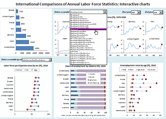
Below, an example of an ILC Interactive Dashboards in action, looking at international labor force statistics:

The ILC dashboards provide interactive charts and graphs created through Excel. Each interactive dashboard covers a different economic dataset. Users can instantly compare and analyze data trends based on their selected inputs simply by choosing the indicators, countries, and the years – and the corresponding visual data appears instantly.
Currently, there are four interactive dashboards available for download off the B.L.S. site:
- Labor force, employment, and unemployment
- Hourly compensation costs
- Productivity and unit labor costs
- GDP per capita and per hour
Using the Labor force, employment, and Unemployment dashboard as an example – users can compare employment rates for men and women across the globe and get a visual idea of the data for easier interpretation. “Data included in the labor force, employment, and unemployment XLS file illustrate the differences in men’s and women’s unemployment rates in various countries,” the B.L.S. wrote in a recent press release. “During 2010, men’s unemployment rates were higher than women’s in Canada, Germany, Sweden, the United Kingdom, and the United Sates, while the opposite was true in Australia, France, Italy and Japan.”

